Integrity Growth
Overview
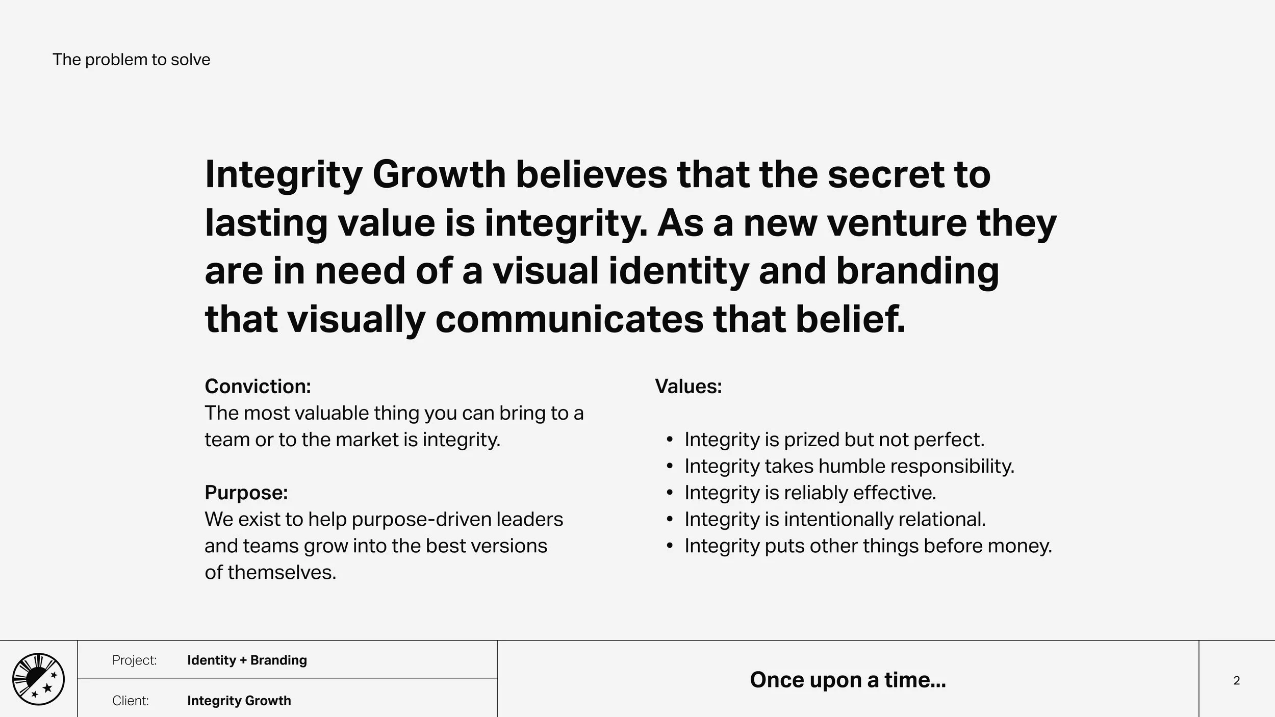
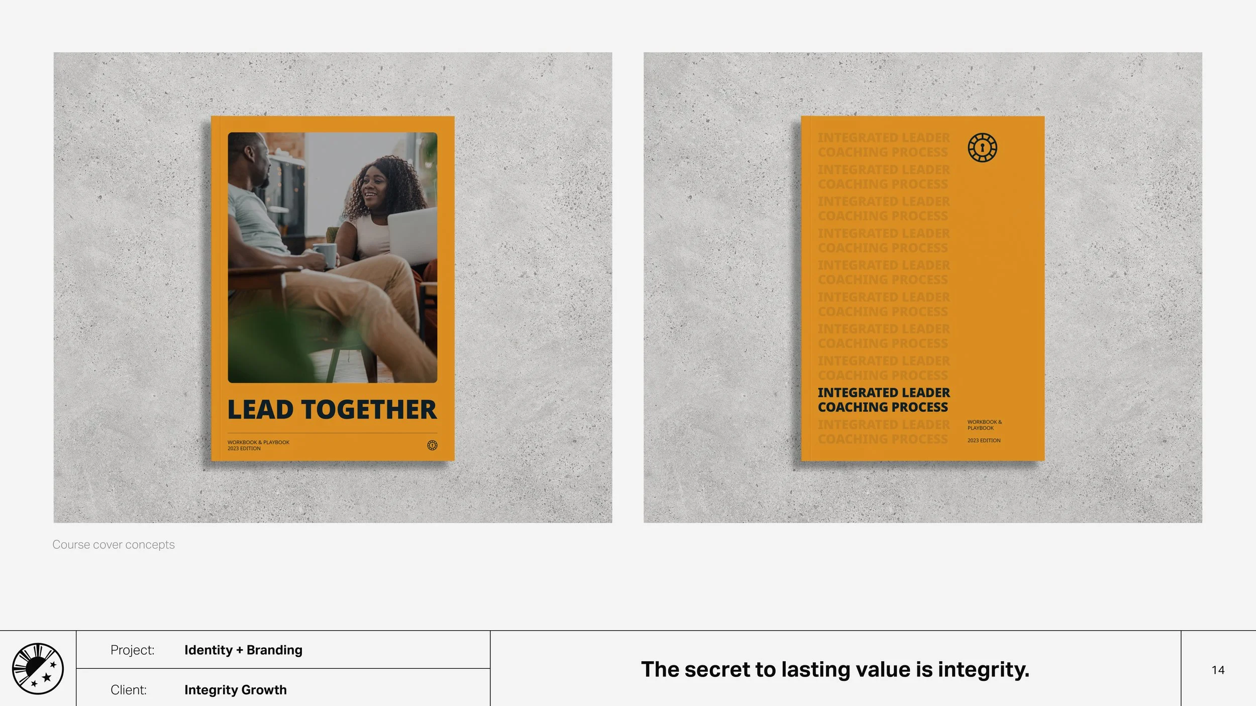
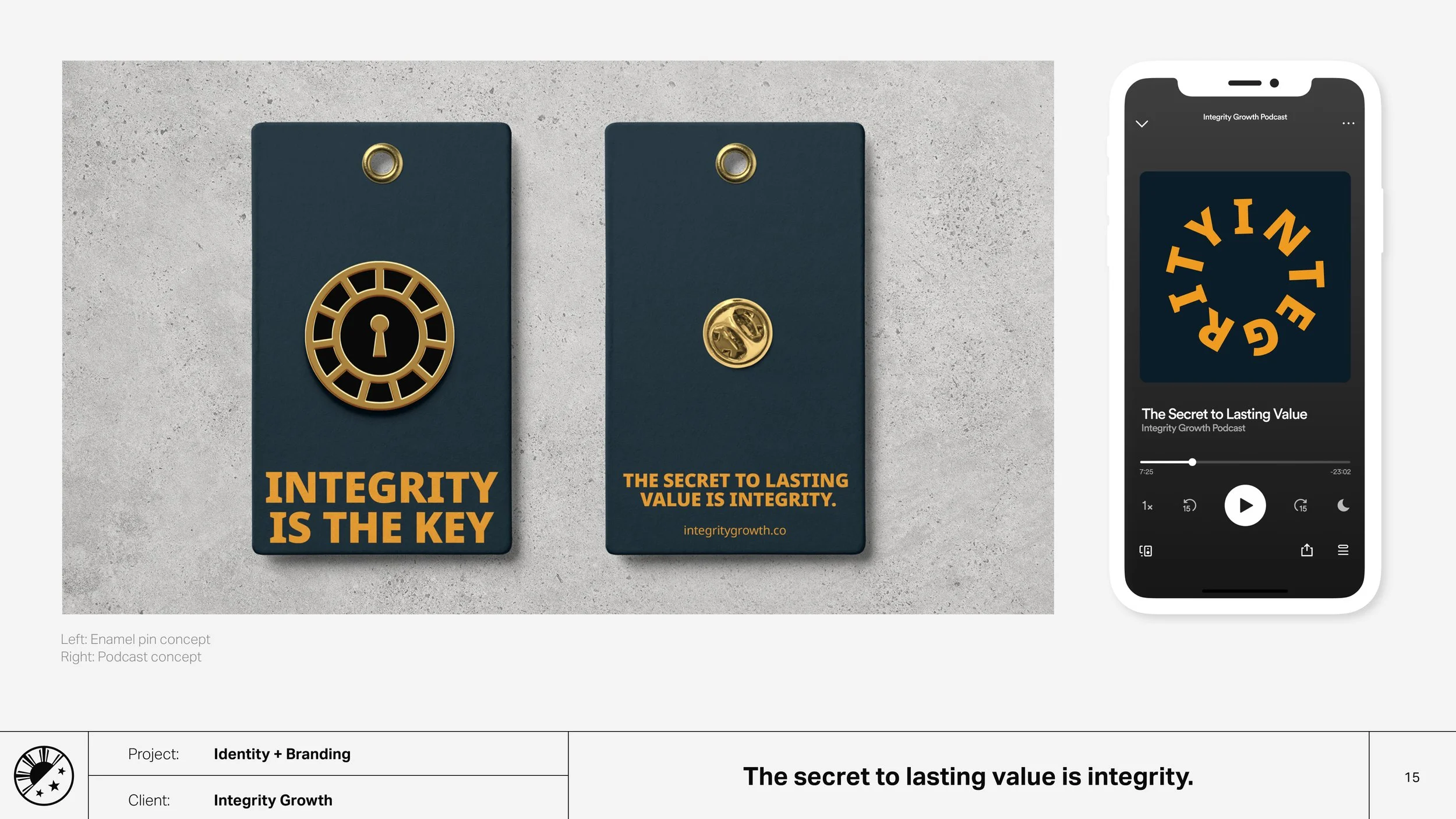
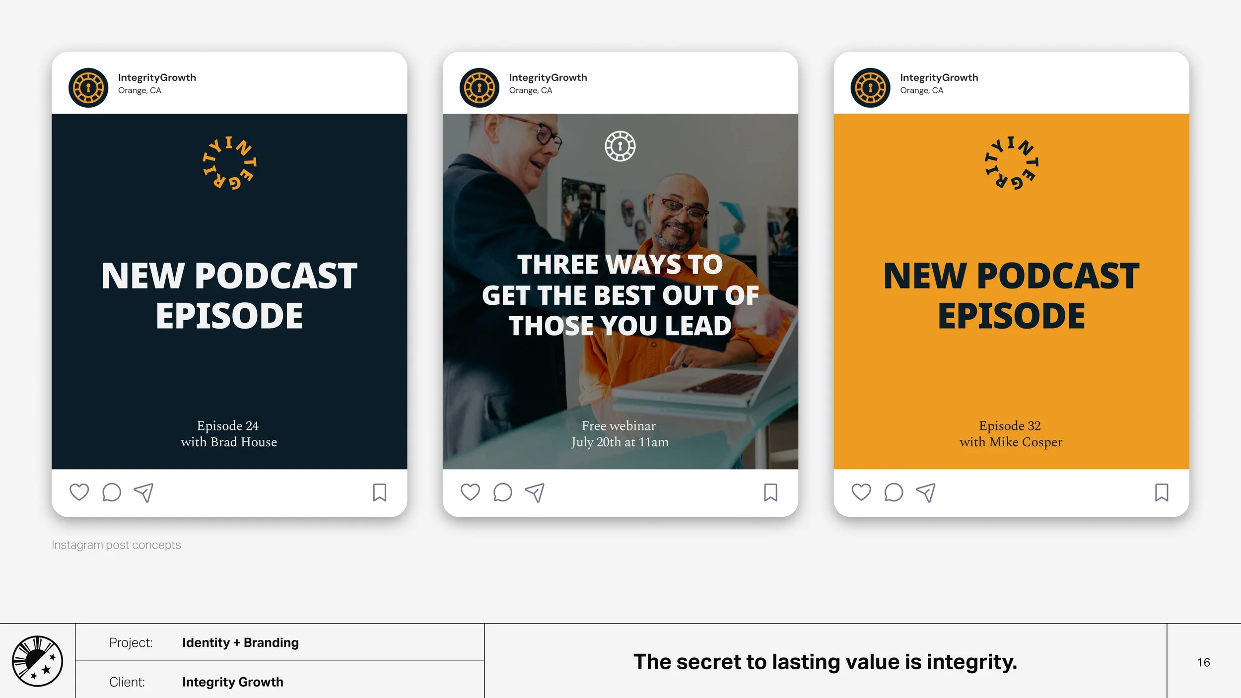
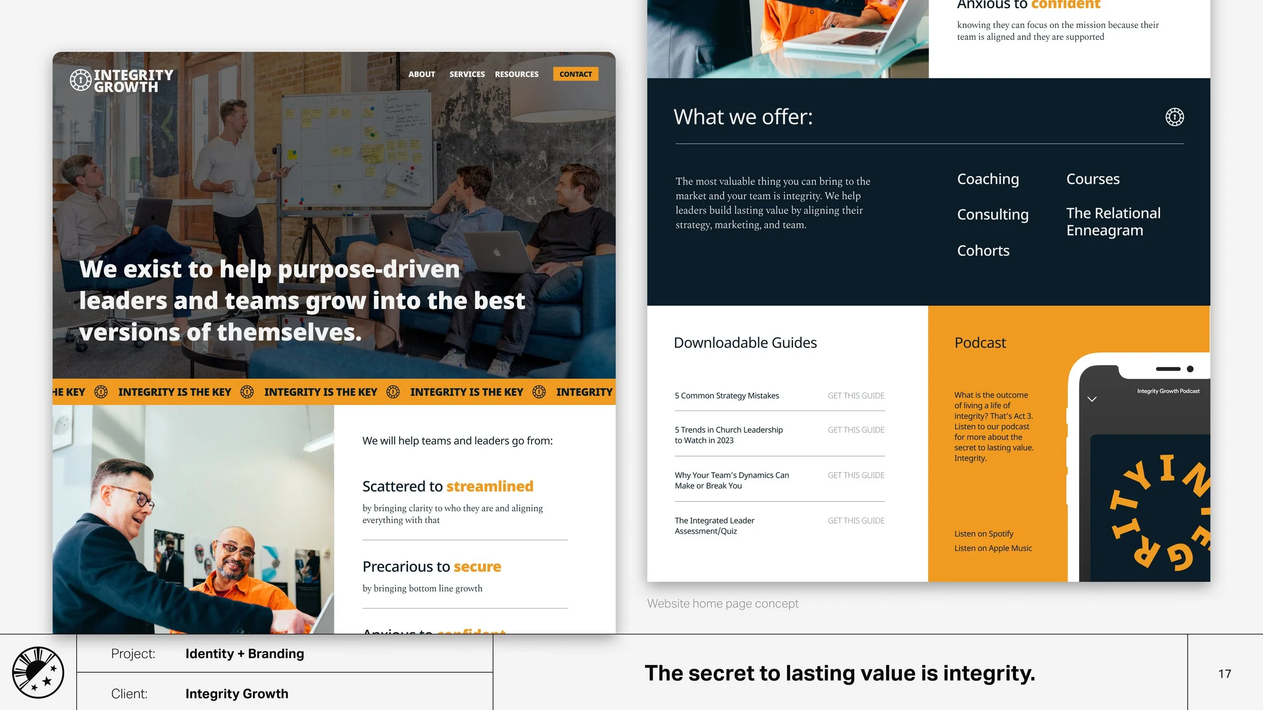
Integrity Growth believes that the secret to lasting value is integrity. As a new venture they are in need of a visual identity and branding that visually communicates that belief.
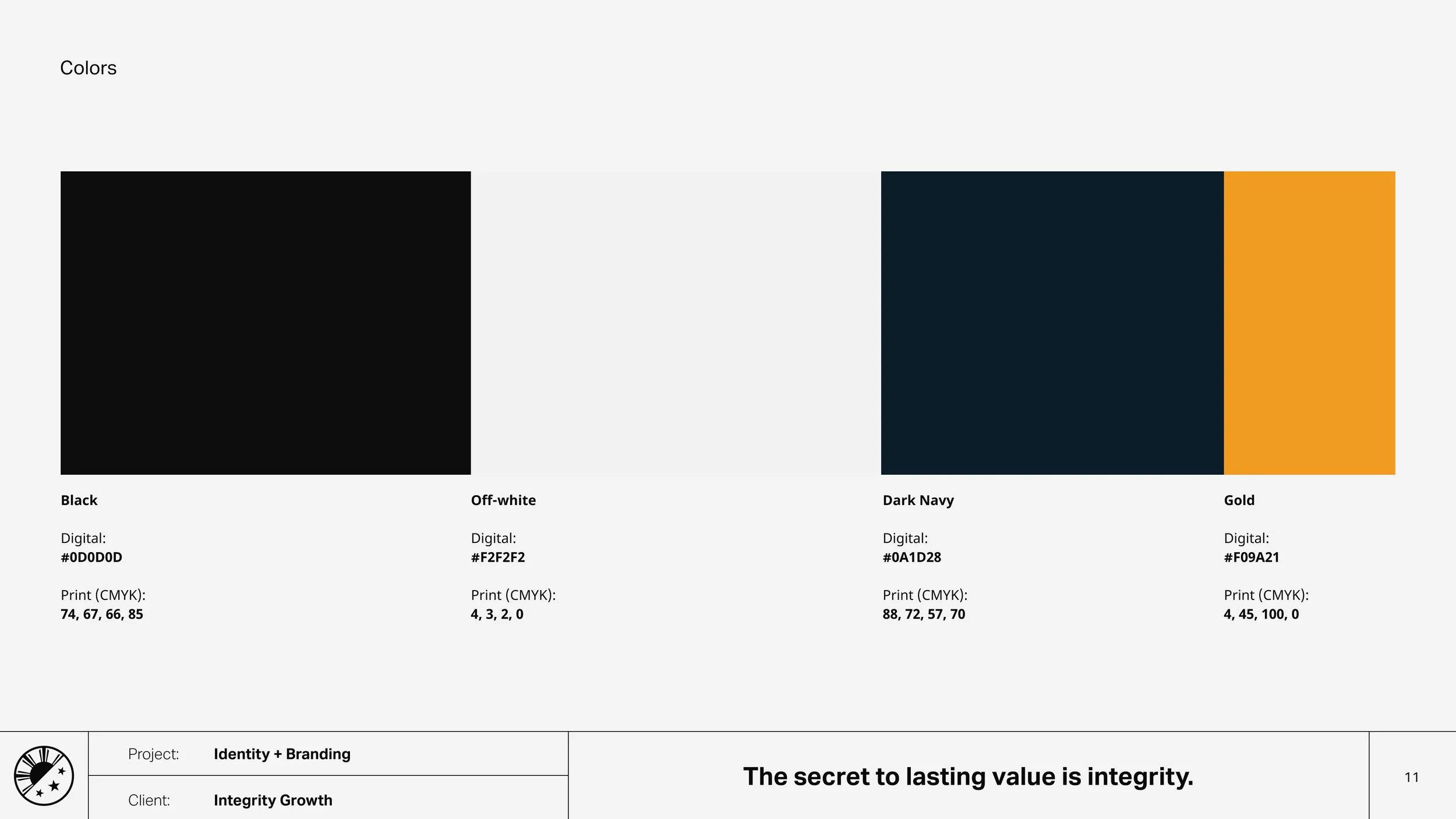
Clarity over creativity. Unafraid to be honest, direct, and forward, thus embodying integrity visually through size and simplicity.
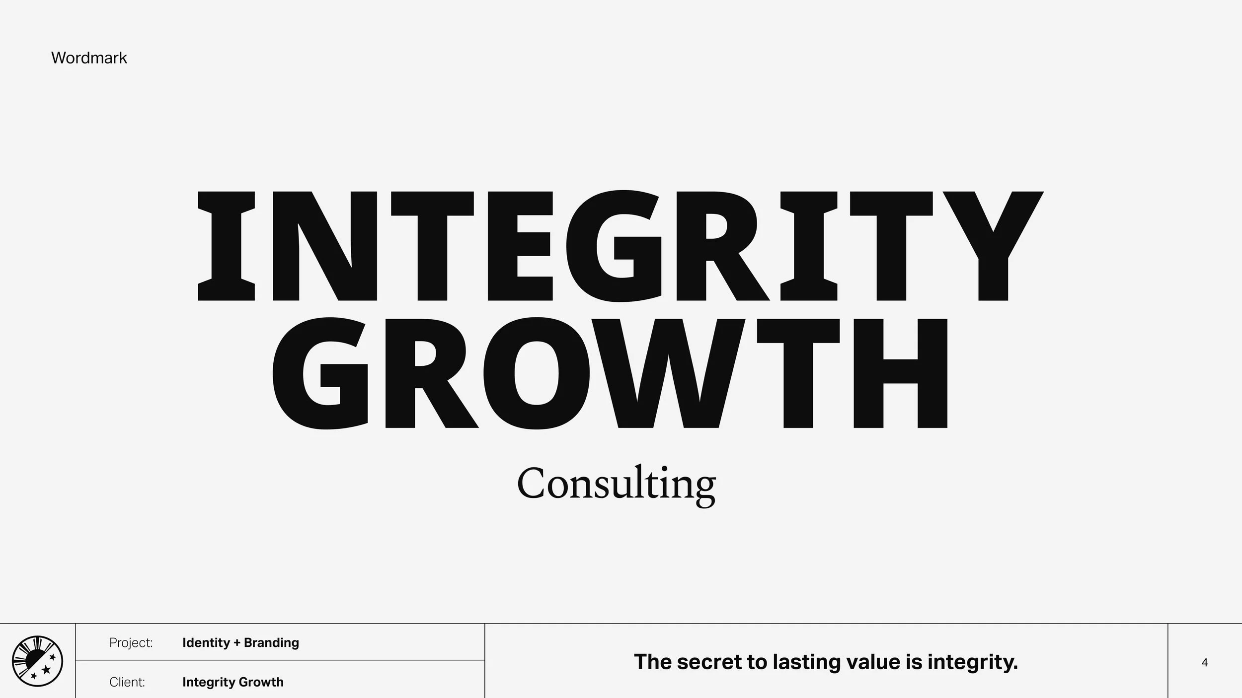
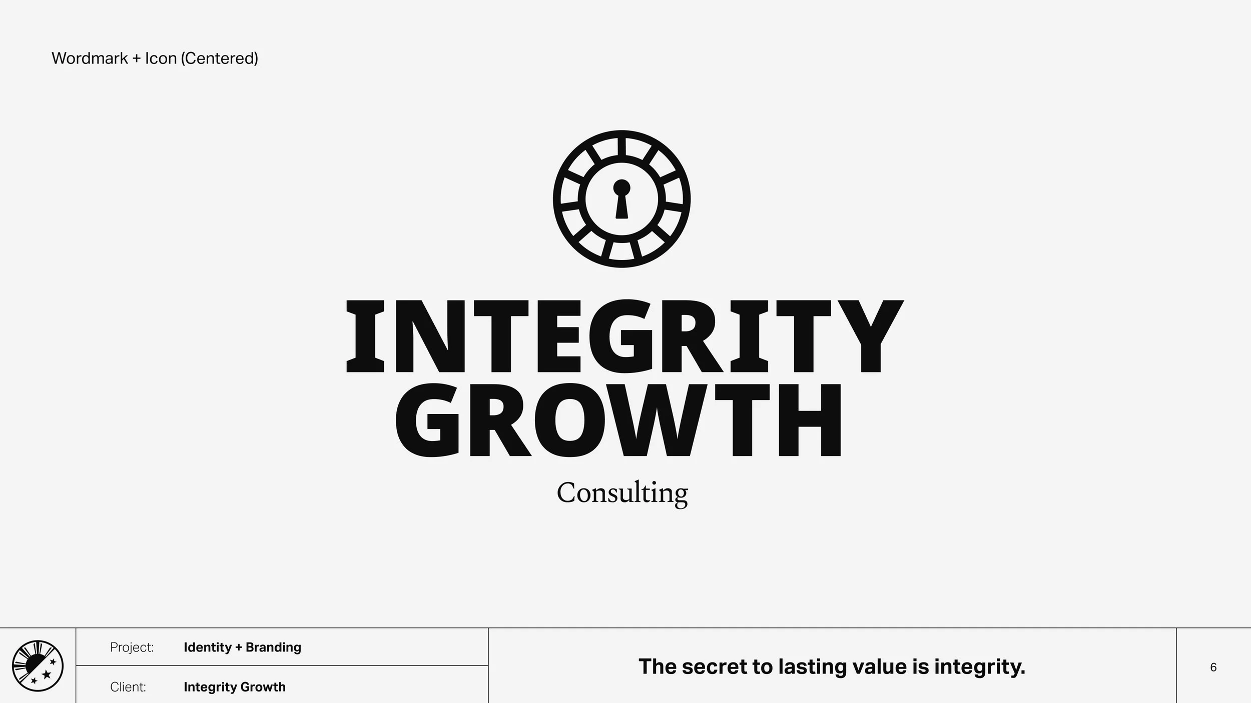
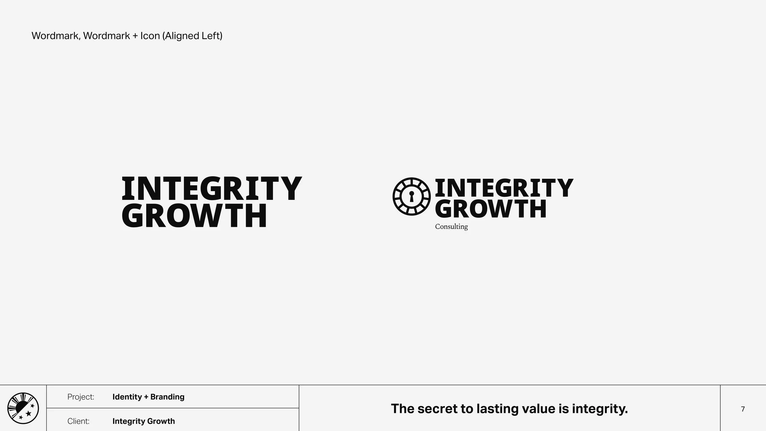
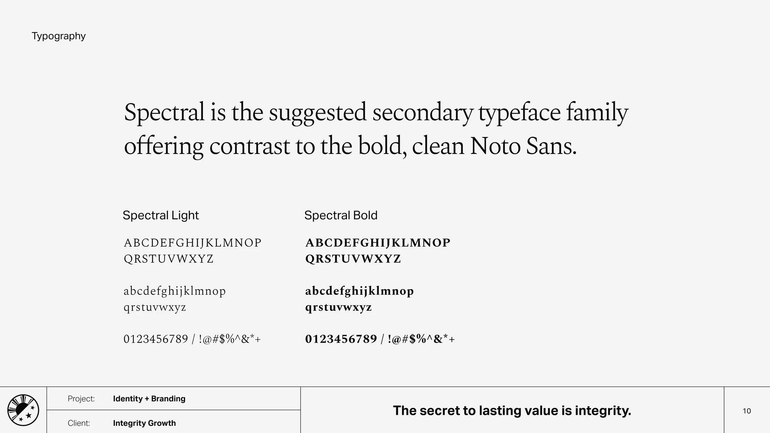
Our wordmark is bold and clear. We lean on large typography choices in order to be abundantly clear that this isn’t fine print, or a gimmick, or anything to hide.
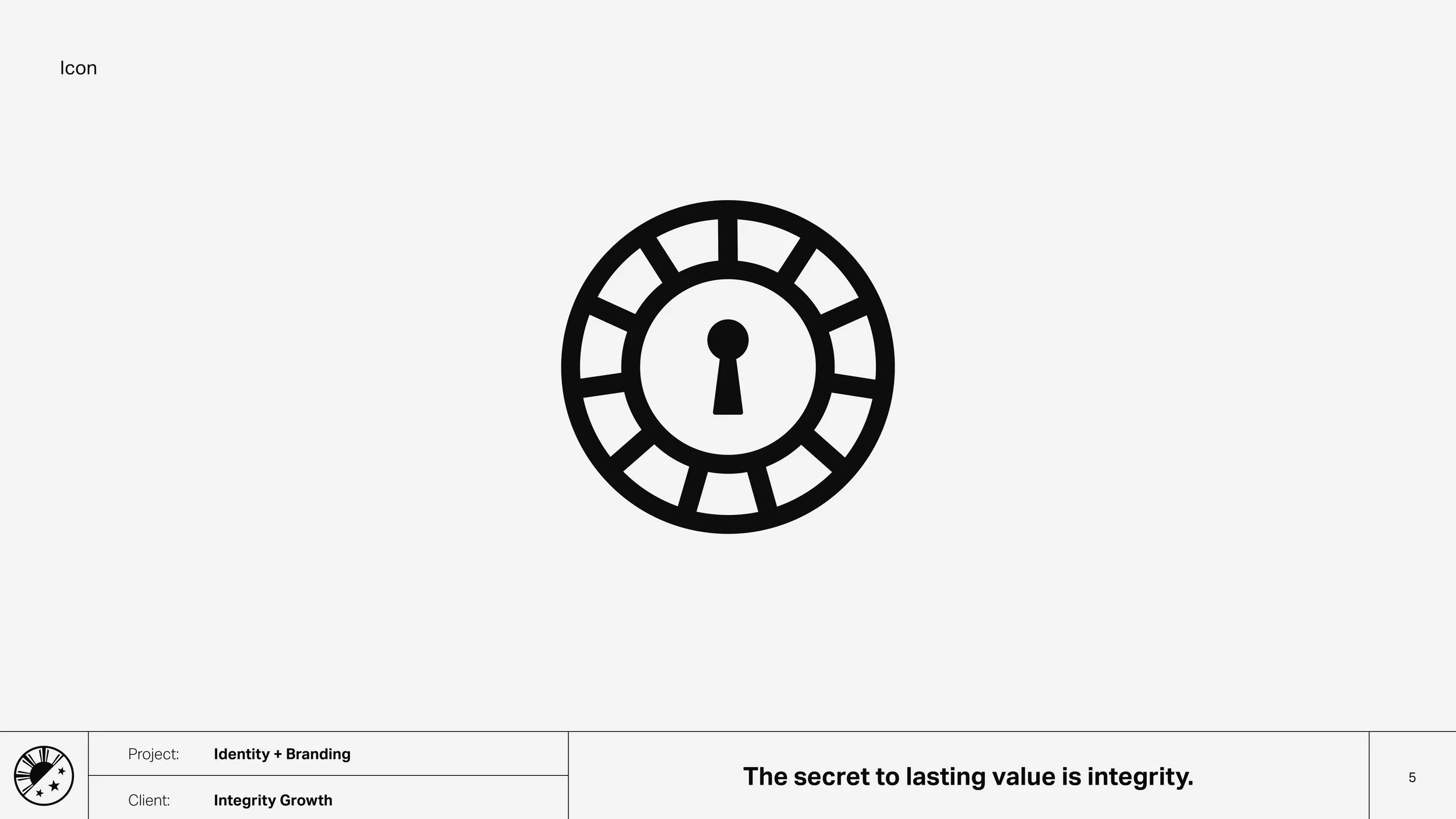
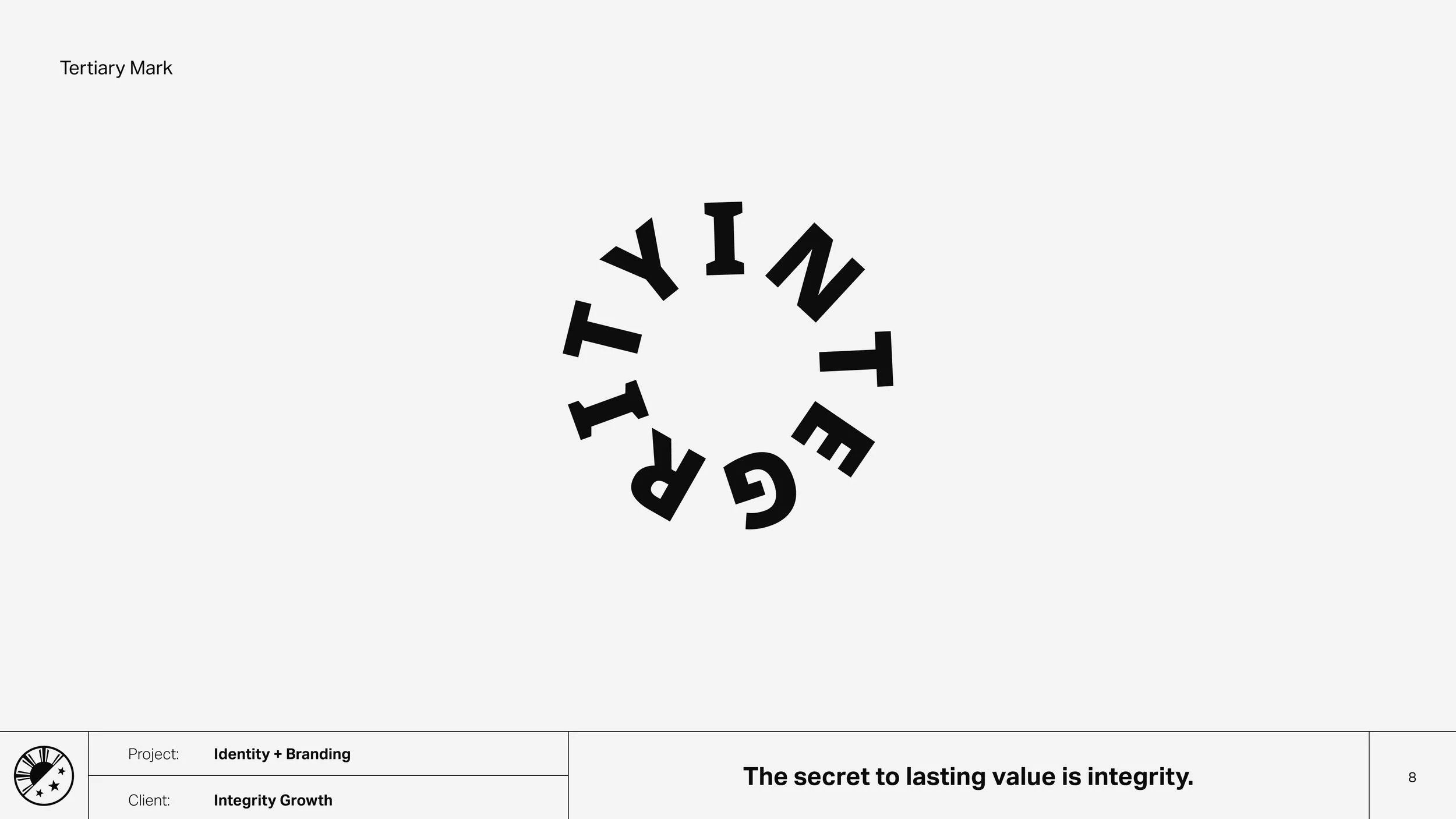
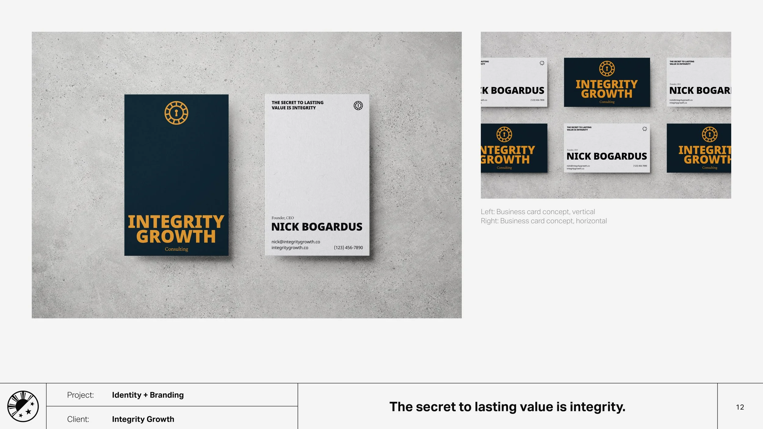
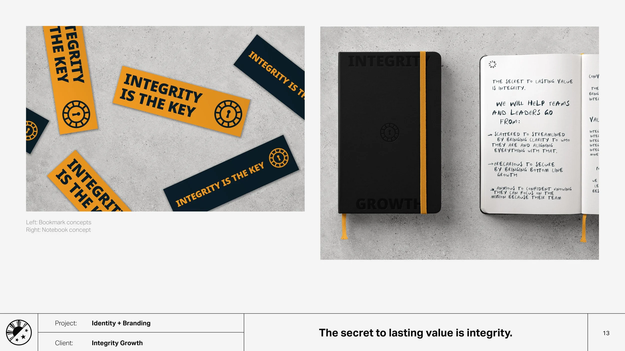
Our icon is simple but with meaning. The round shield has keyhole. The shield represents protection while the keyhole reminds us that integrity is the key that unlocks our value.
*Things happen and this brand was only live for about a year.
Credits
My role:
Art Direction
Design
Collaborators:
Nick Bogardus (Founder)