Currie & Company
Overview
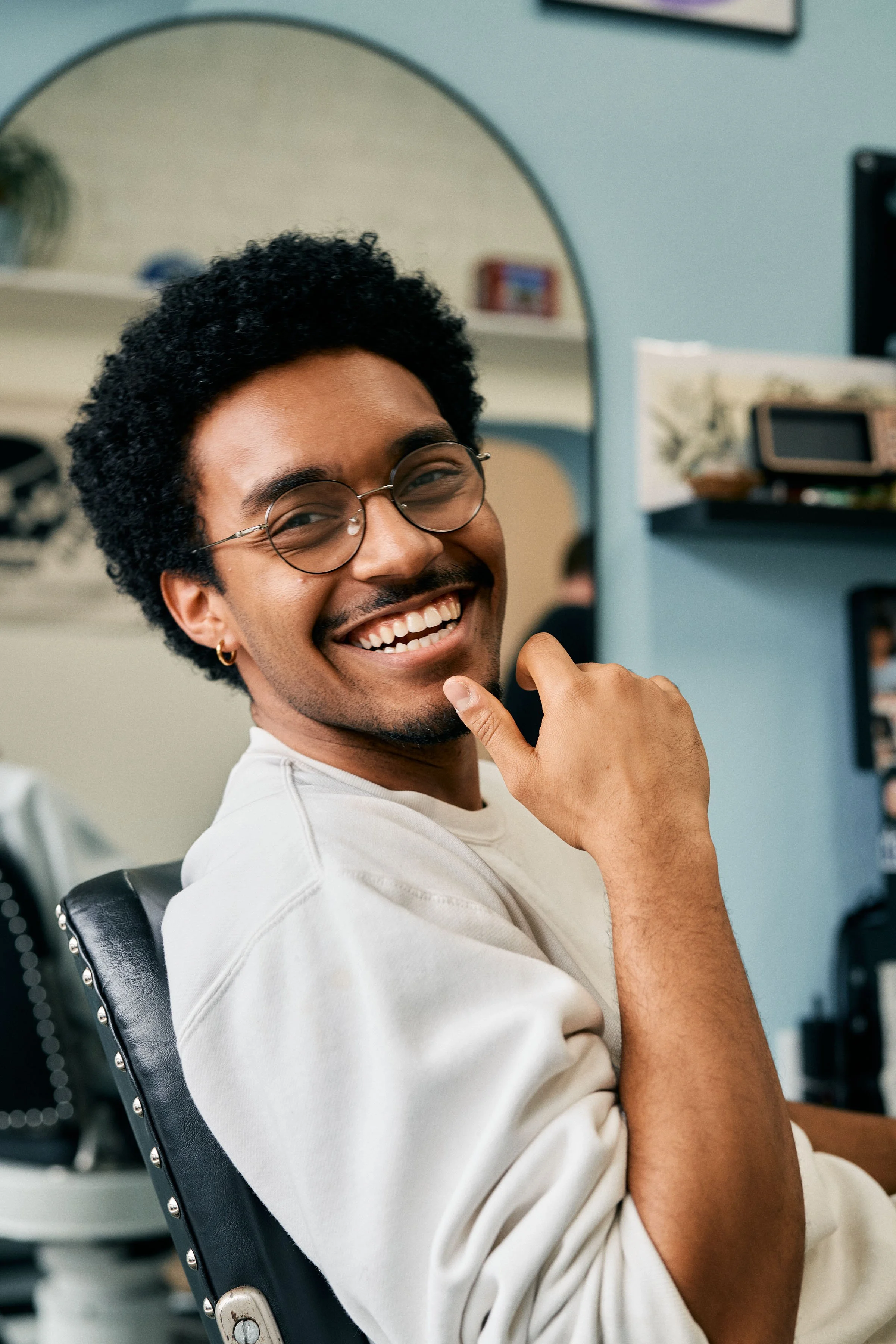
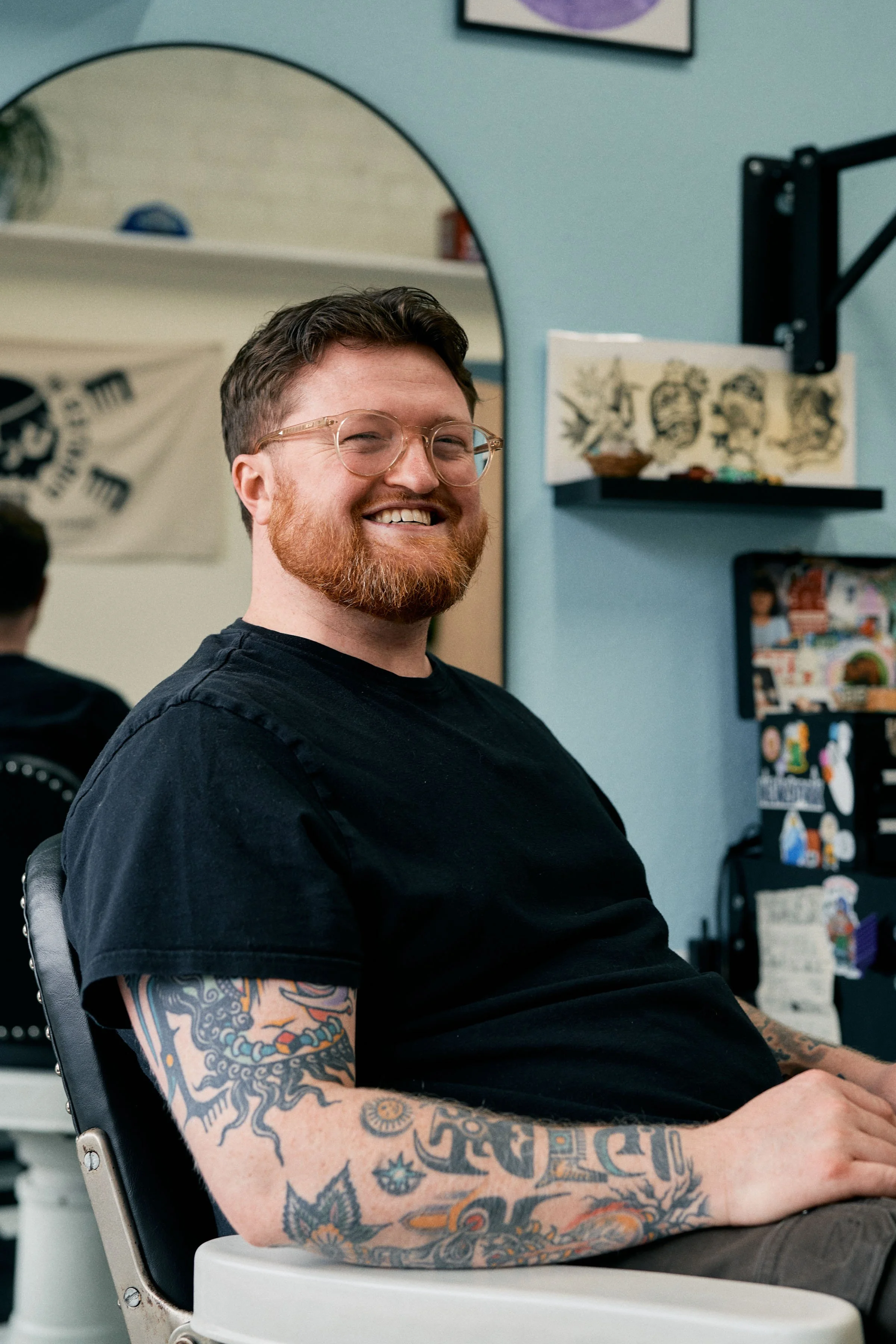
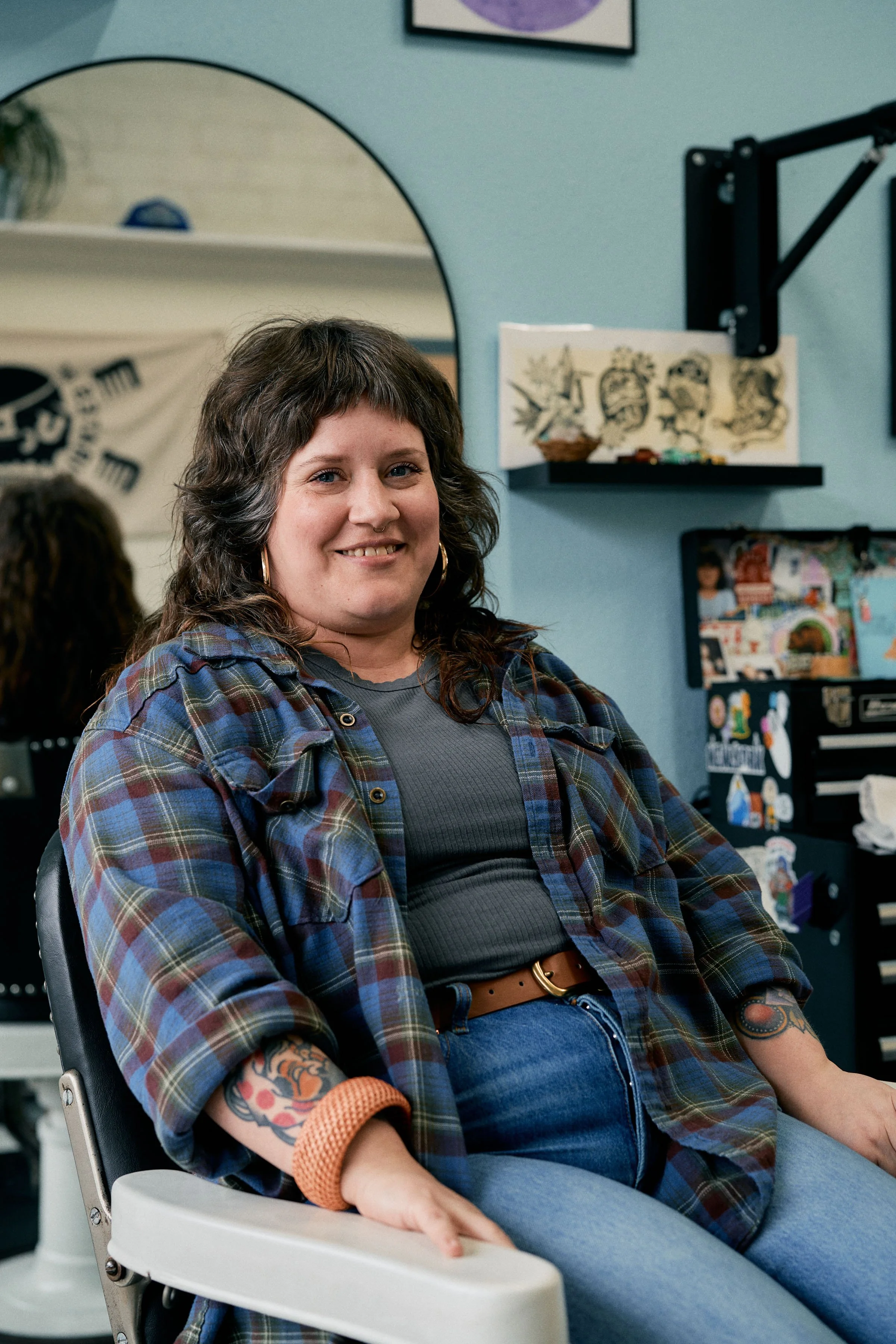
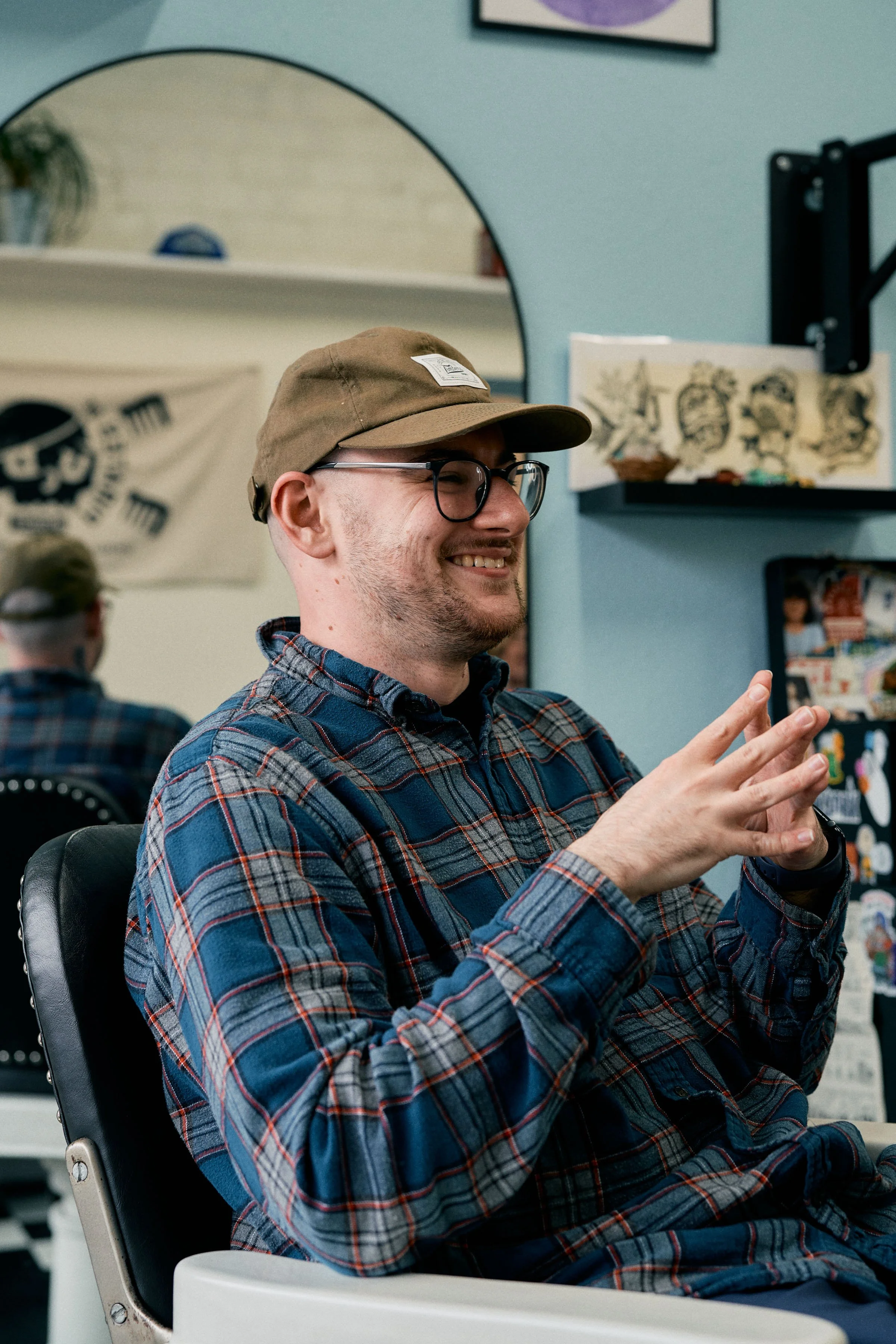
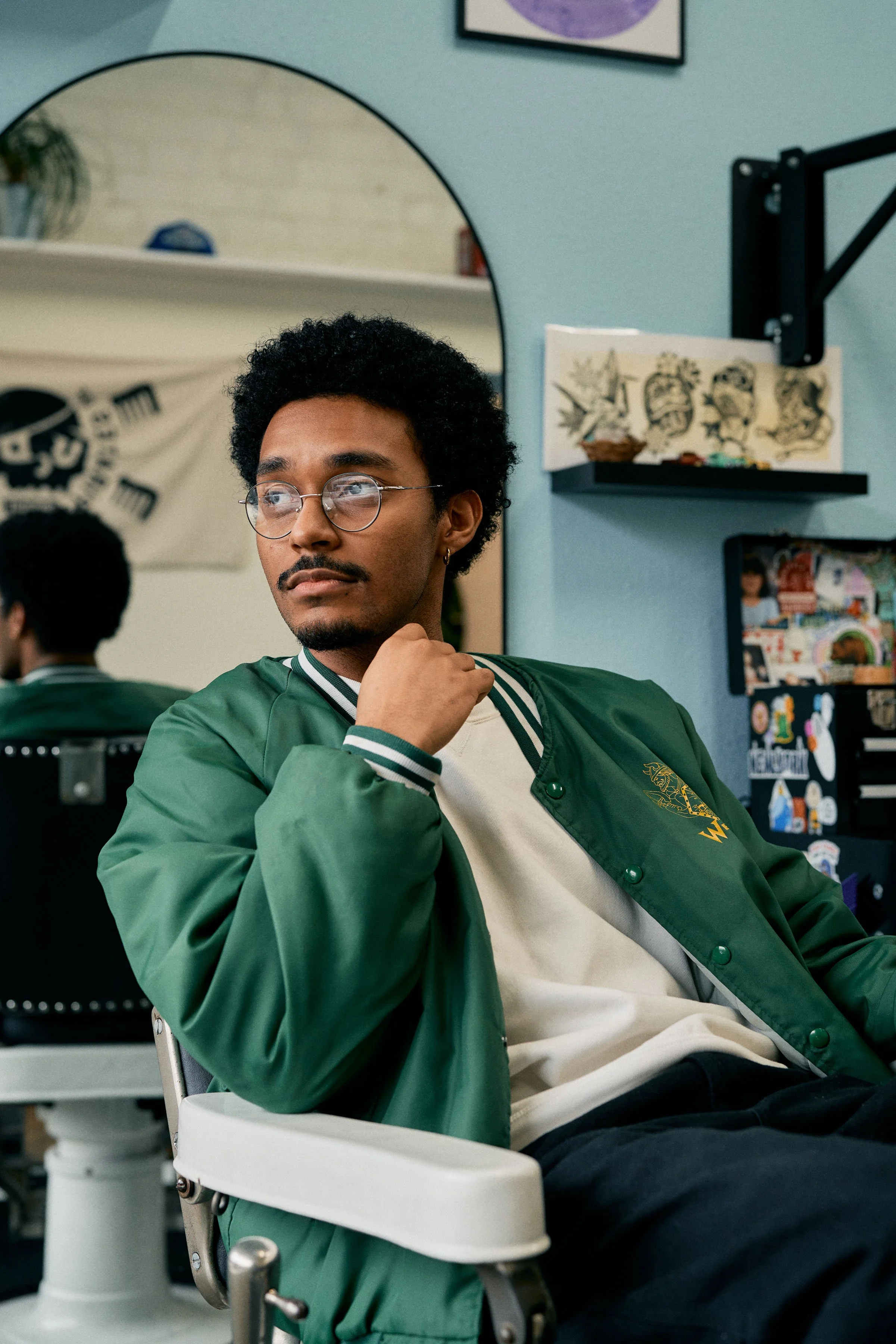
Currie & Company Barbers is a beloved traditional barbershop in Vancouver, WA that believes the relationships formed are just as important as the services performed.
Barbering is an ancient tradition that has been and continues to serve as something bigger than just a haircut. The relationships, community, and bonds between barber and clients is one that is deeply rich and meaningful.
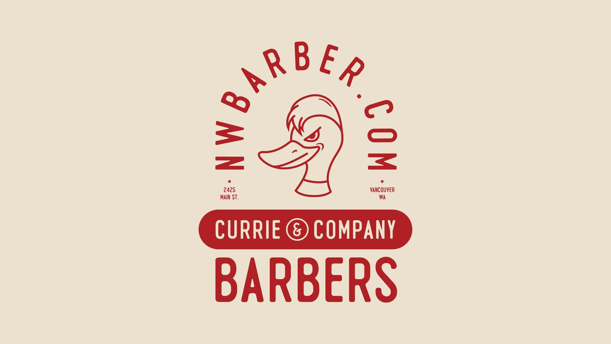
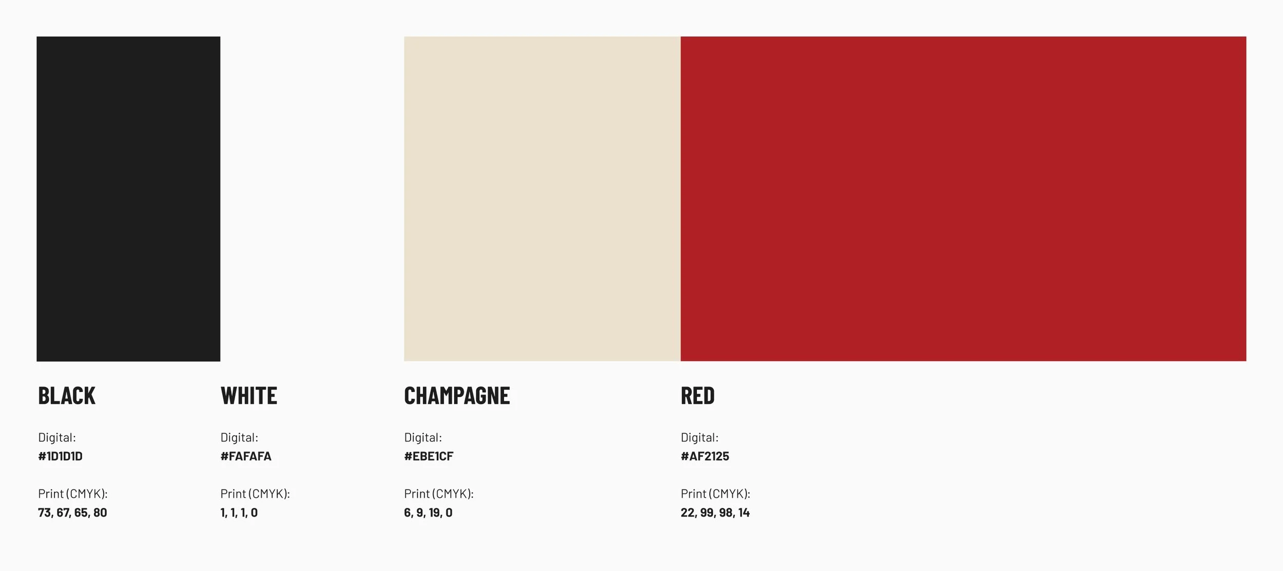
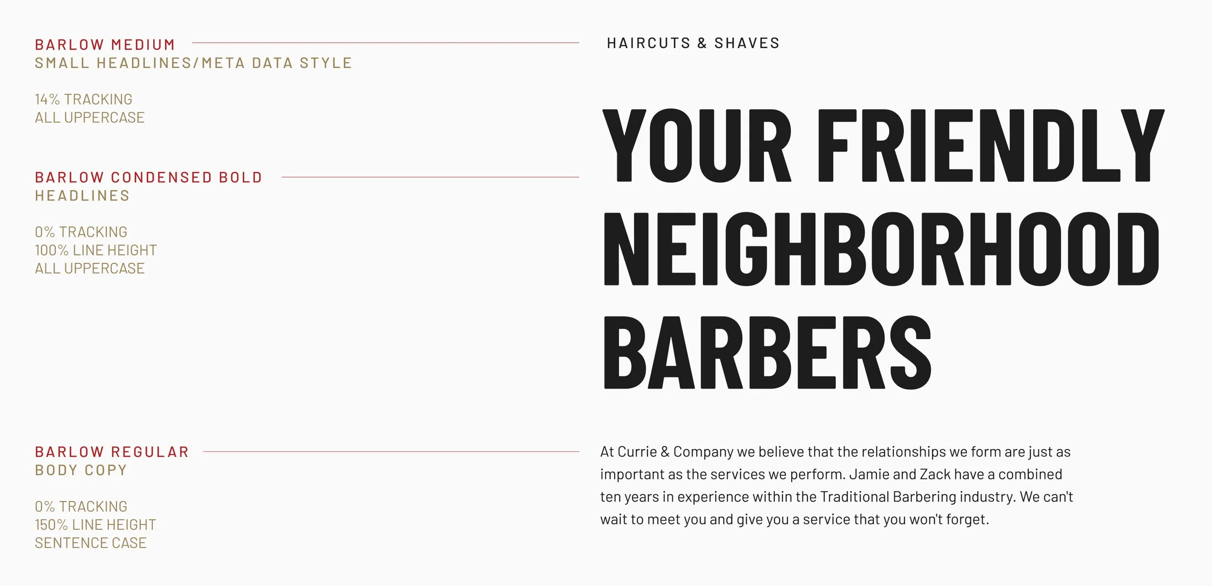
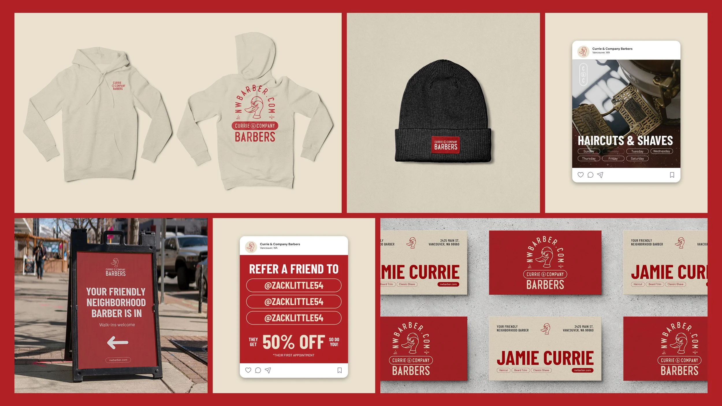
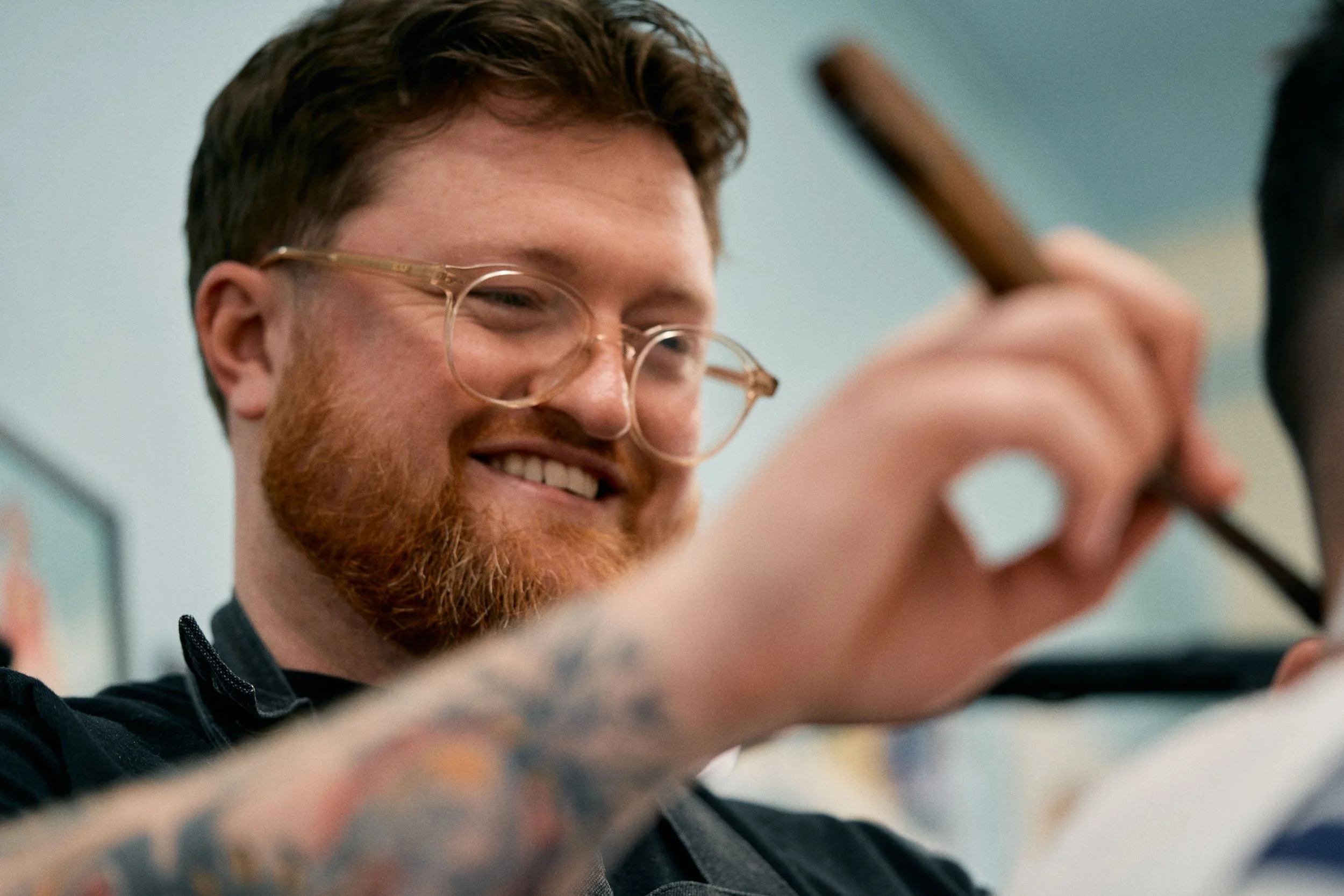
The chosen typeface for the logo is clear and legible while maintaining an organic and humanistic quality in it’s roundness and subtle imperfections. This is a nod to both the past and the fact that barbering is a craft performed by the human hand and each barber brings their own unique self to each relationship and each cut or shave.
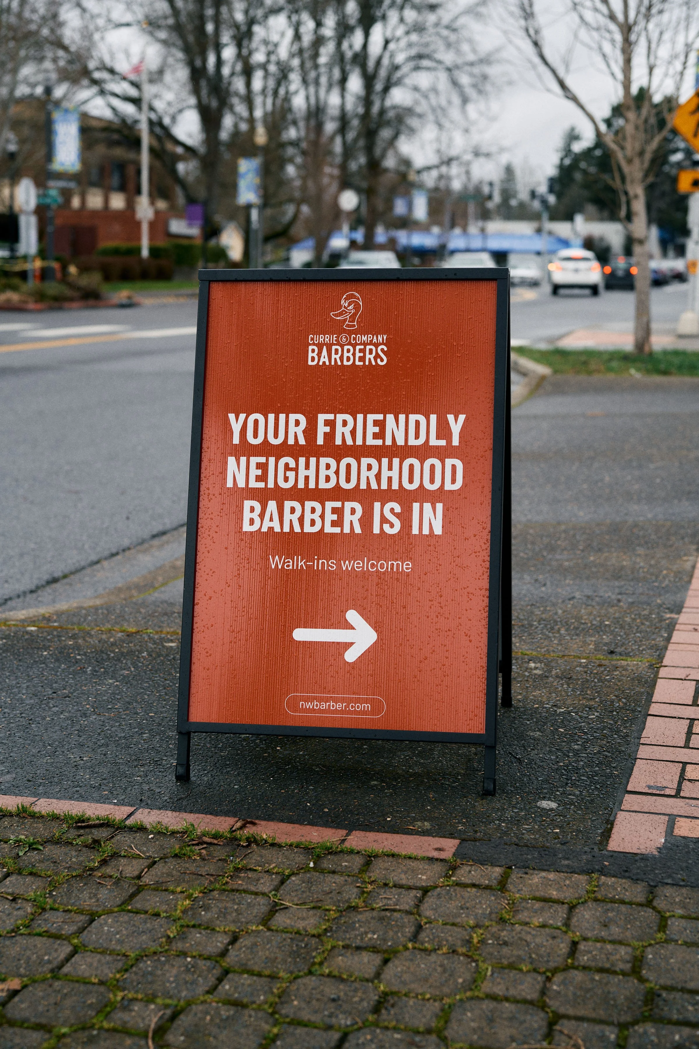
The mascot was inspired by the male mallard duck due to it’s constant grooming of itself in what seems to be a level of seriousness that it takes in it’s appearance.
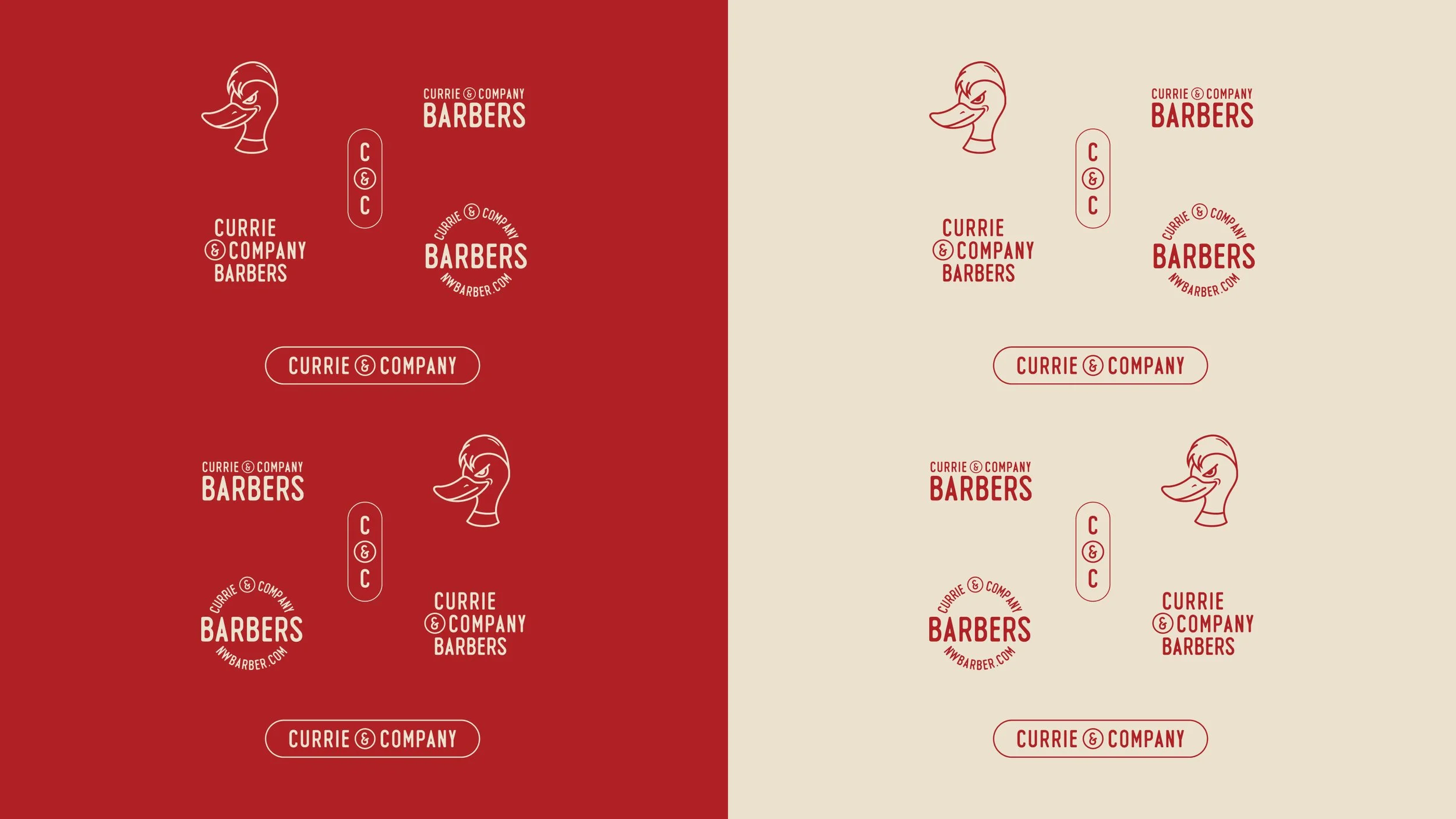
There is also range of lockups and badges to create a design language that allows the brand to have a variety of options to represent itself in the best way based on the medium it is being used i.e. social media, business cards, signage, merch, etc.
Credits
My role:
Art Direction
Design
Photography
Collaborators:
Jamie Currie (Owner)